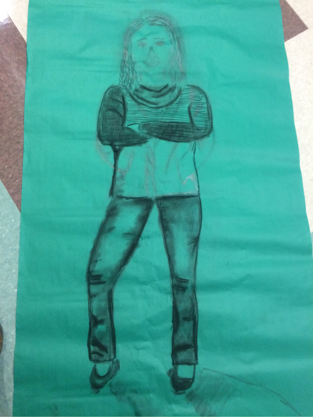
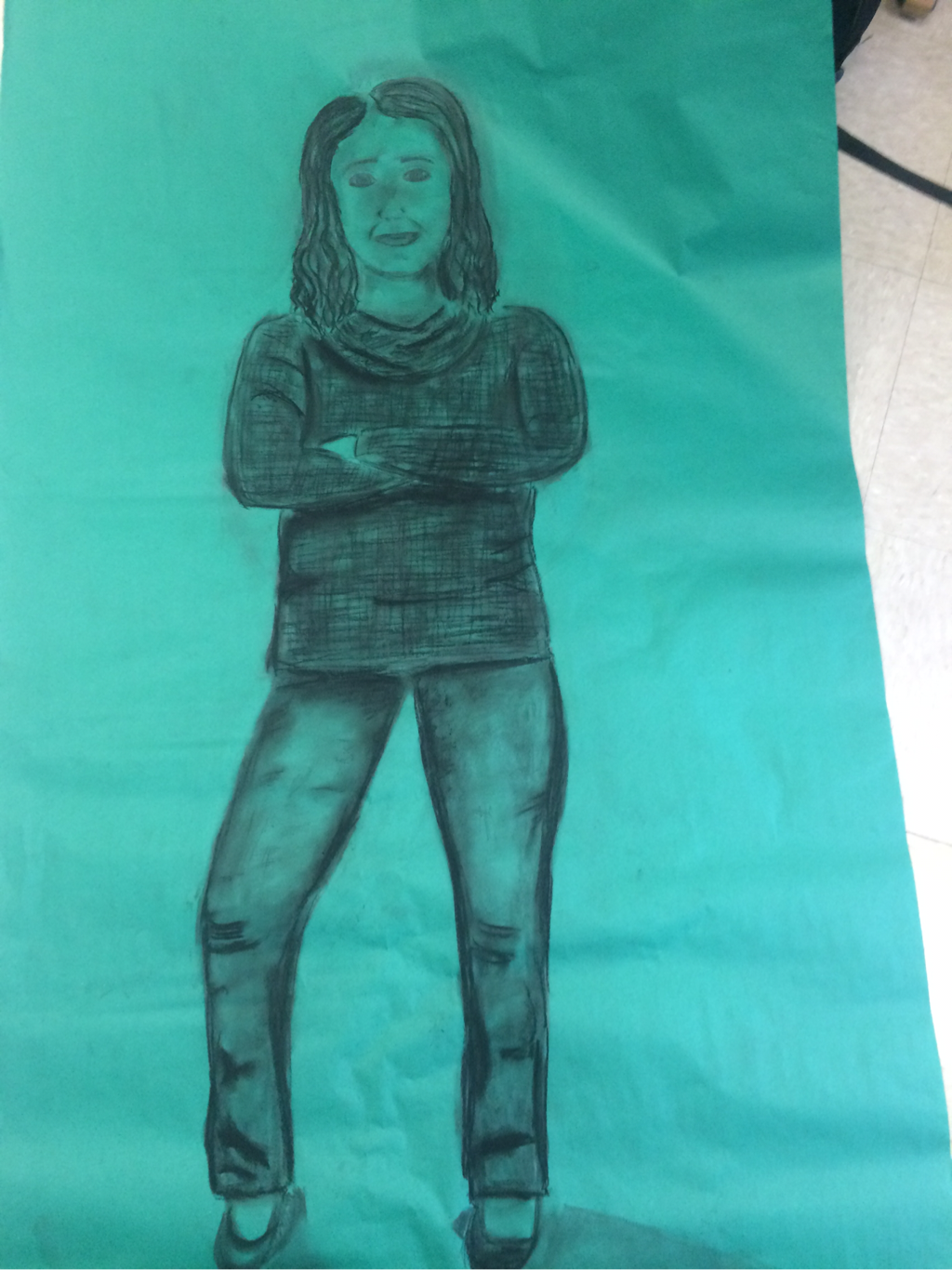
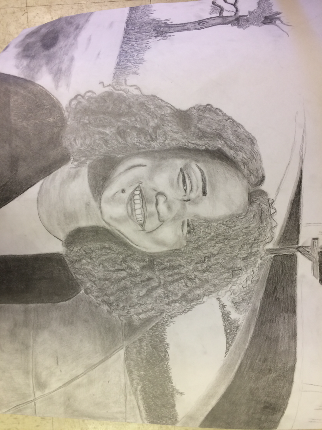
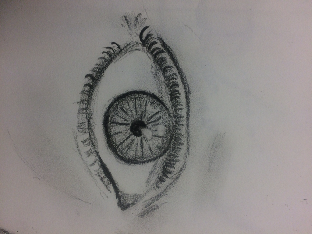
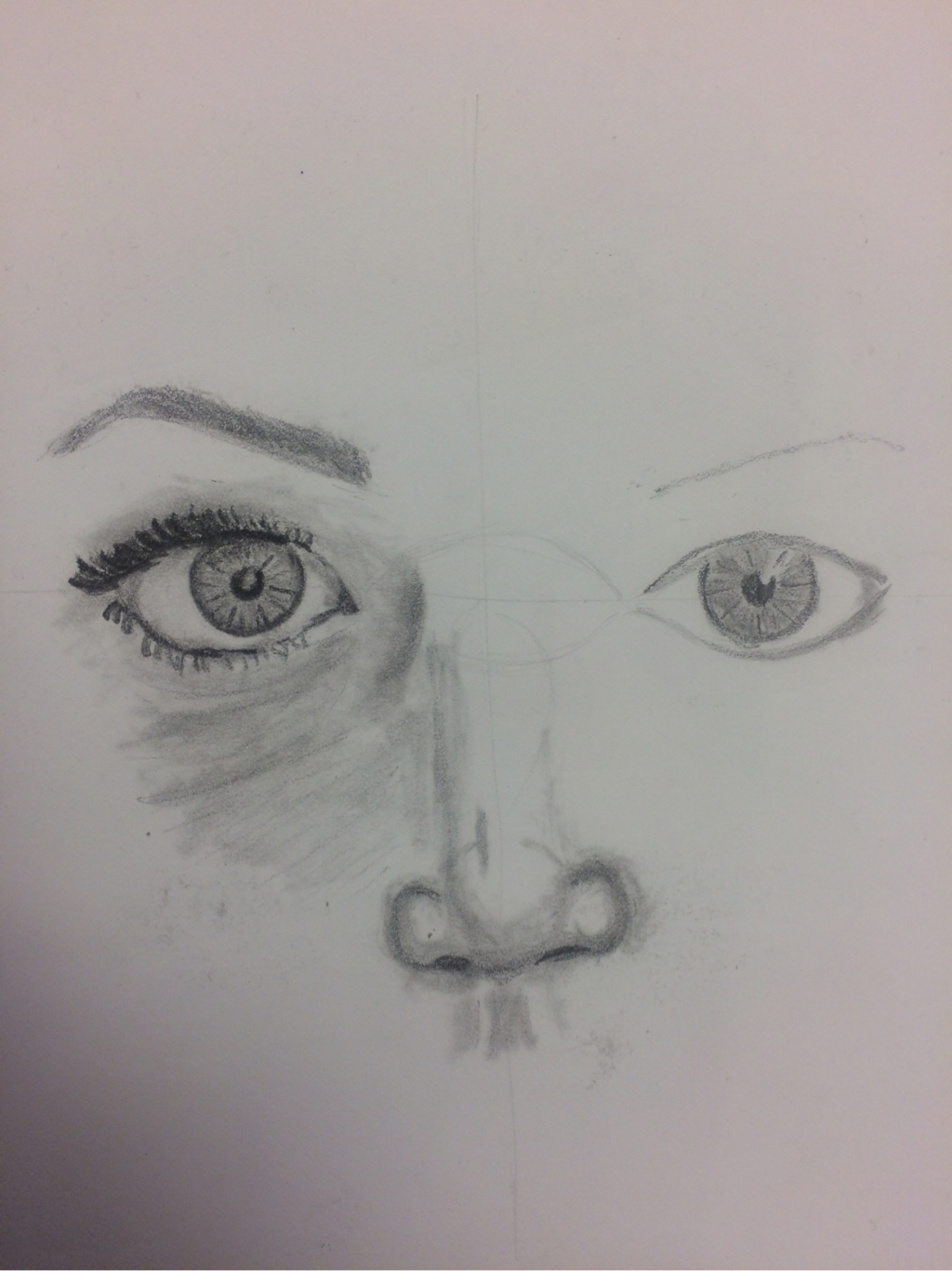
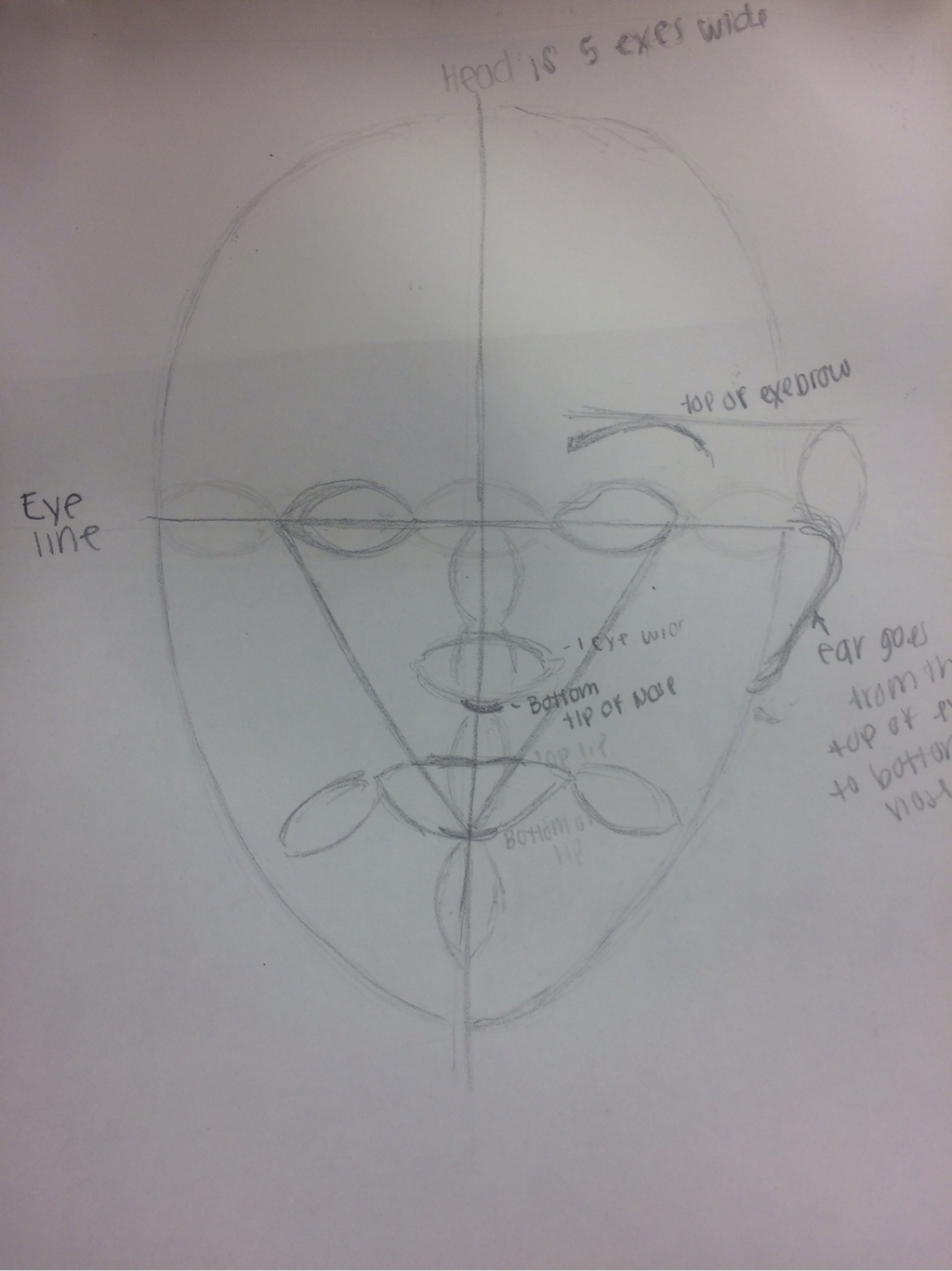
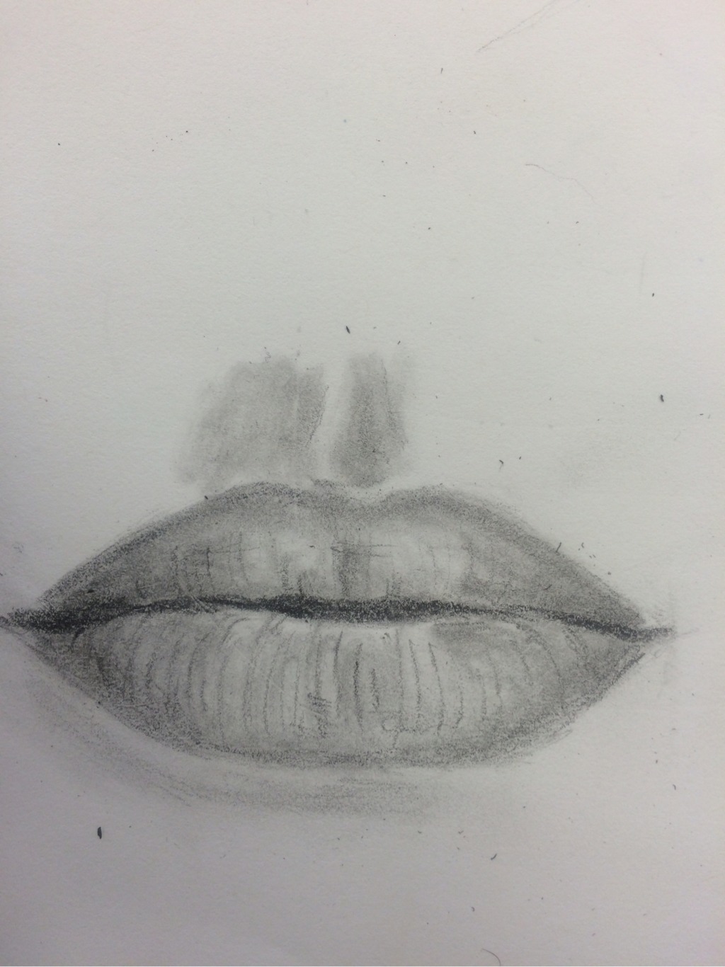
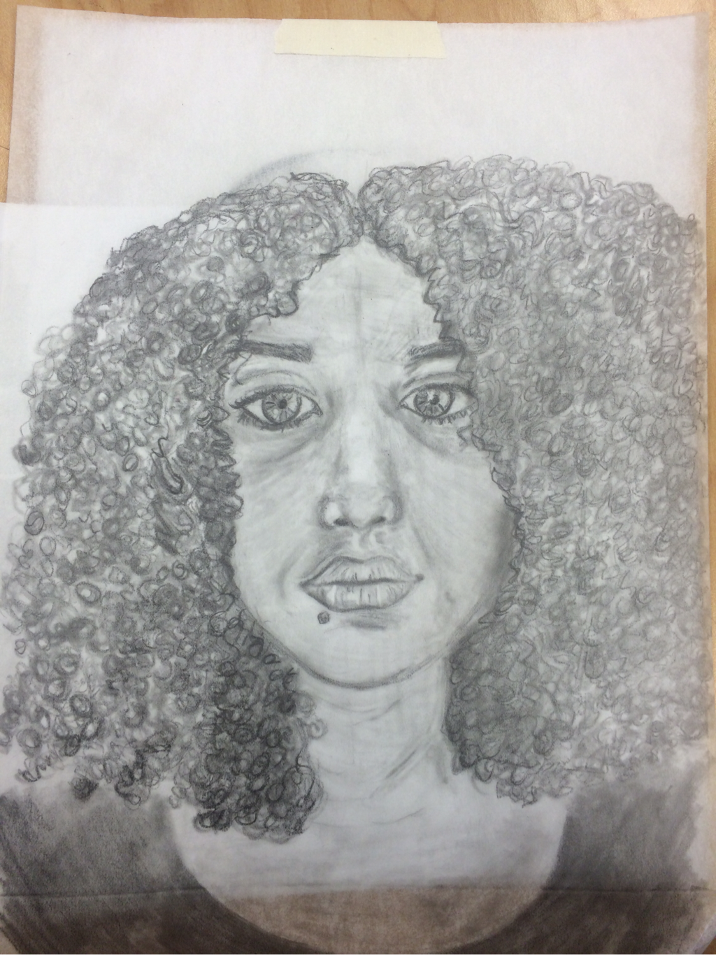
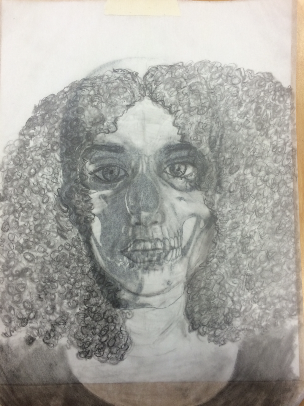
Drawing the full portrait of my class mate I learned how to control charcoal alittle better and not make a complete mess. Also that when drawing with charcoal when it comes to smaller details you have to take your time because of the shape it's not as easy as having the charcoal pencil with a small tip . When it comes to drawing I've gotten better with proportions & giving texture to fabrics . When I first started off drawing wrinkles in clothing & shading areas was difficult and took me a while to do. The charcoal helped make it easier to show the dark areas and it spreads easier than I pencil would making shading simple . Drawing the face with charcoal although was very hard and I kept messing up and is till feel like my face isn't weight but I tried . My piece is actually successful beside the face not looking exactly like the girl but my details and shading are decent and my proportions a. Little off because she's a little shorter in my drawing but this being my first time I did pretty good .
my skeleton drawing is incomplete but what I've done so far is done correctly to me . With proportioning each piece and making sure it was in the right place I would stop and look at the original picture and measure with shapes and think as if the picture was smaller to make sure my pieces weren't to big to small to close or to far away. I drew and triangle coming from the top of the head to the shoulders to make sure it was angles correctly. With each bone I carefully drew a light sketch and after I was finished I looked and made sure the bones lined up and them hen went over and made them darker and added clone . With adding volume I just shaded in the dark areas and made sure I left what showed white alone . I also had to using different techniques like dots to draw on the top of the skull and lines for areas that just showed dark lines down the bone. I think my proportions and volume are good but I could do better with my proportion even though nothing can be perfect .
this is my best gesture drawing that I think I had to draw in 1 minute . I started with the legs because of the position the person is in . With the arms being propped up on the legs I felt like starting with them would make it easier to and make sure the arms looked correctly on the body. I was able to had dark values in areas to show the movement and my make it look like a black blob you can see exactly how the body form is. This is my worst gesture drawing I can barely tell what position I was drawing I was given more time with this one because I was suppose to had detail to the drawing also. The girl was wearing a dark jacket so i messed up by just adding black and not actually trying to draw the little like arms. I think I may have started drawing the wrong area first I should've started with the legs so I could have made sure they fitted in the drawing & then worked up the upper body .
for my scratch board I decided to keep it simple and draw gears when I first started with the one in the middle I thought I was going to make just one but once I saw it I decided to make multiply ones and also give them different looks so the piece wasn't so plain . After drawing them I felt like I needed to add the little lines and to make it even more realistic make some parts whiter than the other to give it a look of a glare.
My problems with the details were making sure my lines were actually neat and not sloppy as if I was just rushing & making sure they curved correctly in the circle formation . Each little piece surrounding the gears is what I felt like I was going to mess up on badly . if you look closely you can tell that some are taller and skinner and more far apart than eachother and that's what I tried to go over and make blend together better . I did the best I could to fix them but thy still aren't very proportional. The movement lines were the hardest for me bc I didn't want them to just be thing skinny lines I wanted to make them a little thicker in areas but the knife didn't really give me much control and sometimes I would slip up and have to take away more black than I intended . Overall I think my drawing came out good . You can't really spot my mistakes as easily as I thought & I liked drawing having to use white and take the black away to create the picture . I'm always use to shading so doing this was something good to try and I hope to do more pictures like these and try things more difficult to draw . for my self portrait I decided to do expressive with me smiling in pencil . Using pencil was easy some what when it came to shading but my shading was uneven in areas and was her to blend out. The most difficult part of this for me was the grass I felt like I couldn't get it to look realistic and then it was so much space for grass that I got bored with it and couldn't finish it in time .
i enjoyed learning ways to draw each facial feature & how to place each part on the face . With drawing eyes using a almond shape really helped form the eye & I learned help to make the lashes go the right Way and how to shadow the eye to give it a realistic look . I've always struggled with making a nose so when I learned that the nose only needed two lines & the rest was just formed from shading it made it really easy for me and . The lips were also something I struggled with a lot I could never get the inside part to look correct so when I was taught to just add shading to it my lips actually looked more real . Placing all these parts together was easy with the help of using eye lengths to measure the entire face without it I feel like o wouldn't be able to place the eyes, nose, & mouth I'm correct placement . The warm up that envolved drawing my partners face was kind of hard but was really good practice for me when it came to drawing from life objects & it helped me with drawing better eyes and different kinds of noses
Drawing over the skull to me was very difficult because all the shade and lines made me lose focus of how my face was suppose to look so I had to keep putting another paper underneath to help make sure my face looked like a normal face . The skull is a good tool after you finish your picture because when you have the picture over top of the skull you can see if everything lines up on the skull like its suppose to . Drawing faces has always been hard for me because I felt like I could never make it actually look like the person and it was more cartoonish that realistic . Drawing myself for the first was actually ok , I did better than I thought I would because I pushed my self to actually try harder than I have before & my shading/values in my face could be more smooth but there ok . Drawing my curls was kinda easy because my hair doesn't really go one way it's everywhere so all I have to do really is draw curly lines going every which way & then blend them . Overall I think this project was a lot of help for me when it comes to drawing realistic people ,
for the transparency project I drew marbles in a plastic bag & filled in the empty space with a sign & colored the wall behind it . I enjoyed doing this project because I never tried drawing something transparent & this was good practice to me . The marbles and bag could have been better but atleast I tried to give the picture the illusion of transparency . When it came to my letters I felt like I did a good job with making straight lines . My blending of colors could be better & should practice with using chalk more but over my piece is decent looking & the bright colors are attracting .
i missed a day to complete this piece but this is the starting of a watermelon jolly rancher . I used prisma chalk to create a see through image . Working with chalk it was hard for me to make the colors bright enough to see and not look dull . My writing was the most difficult because it was hard making sure the letters were proportional & not to small it big . I feel like the ends to yhe candy where the yellow is are pretty good & I liked how it turned out somewhat . I learned how to add light values to give a drawing an illusion of looking as if you were looking through plastic & I enjoyed working on this with the little time I had . Next time I would like to actually get to finish my picture & work on my letters & shading
i drew a dum dum lollipop out of prisma color pencil . I liked using prisma color with this assignment because I feel like it really does blend better than normal color pencils . This piece helped me with learning how to draw smaller details on objects & drawing letters . I think I've improved alittle more with using prisma but I could still work on certain things to make it better . Such as adding more wrinkle details & letters are also not as neat as they could be so I should practice more with writing out things when drawing .
|
AuthorWrite something about yourself. No need to be fancy, just an overview. Archives
January 2016
Categories |